How to set up chatbot responses
Your chatbot comes pre-built with many things it knows, based on the dataset and questions customers and training Yonder has already done. Whether your chatbot has been set up by Yonder, or you're doing it yourself, here's how to set-up responses.
Is there a response active?
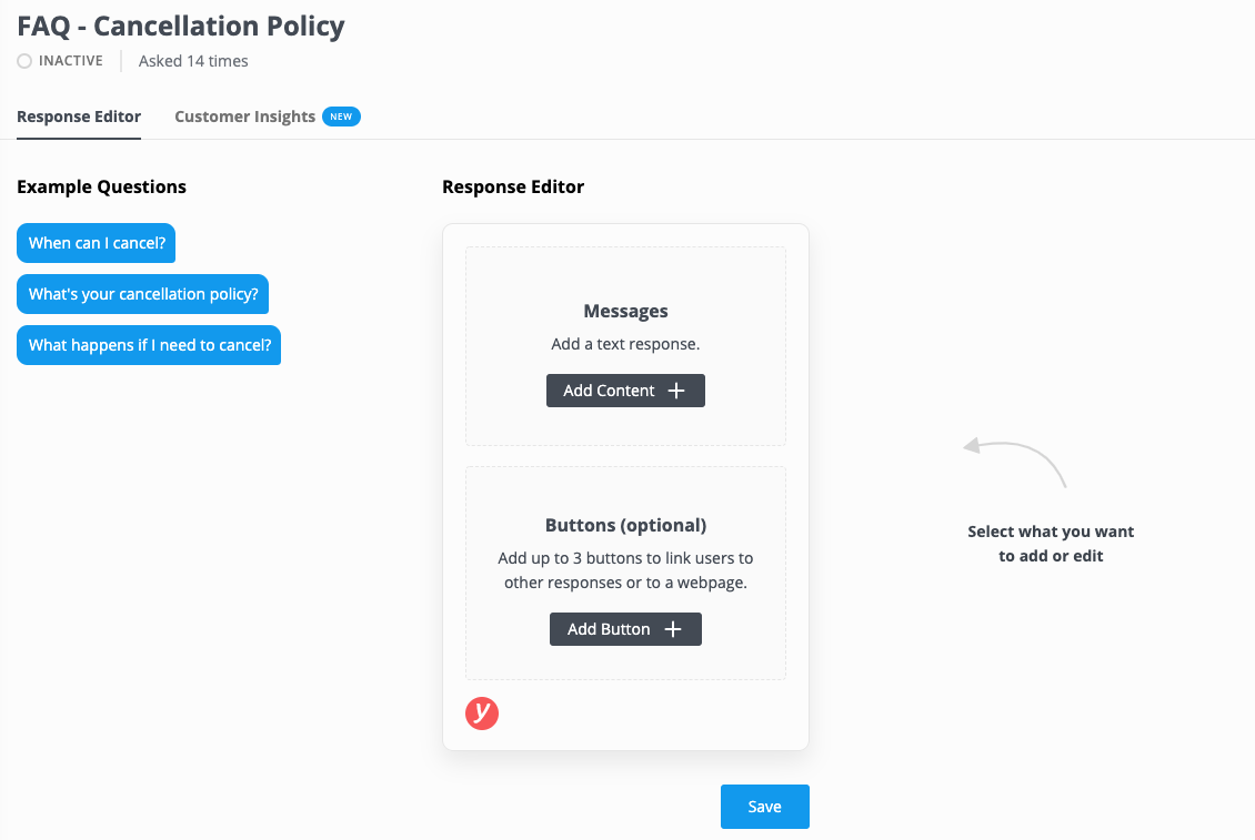
In the list of responses, the far left icon indicates if there is an active response (Green) or inactive response (transparent). If a response is not active, when a customer asks a question related to it then the fallback response will be given. In the example shown below "Cancellation Policy" has no response set-up but customers have asked about it 14 times, in those cases they will have received the fallback response.

Some questions may be indicated as "Managed by Yonder" (by default the question list hides these, you can show them by clicking the toggle "Show managed by Yonder") which means responses are set-up a managed on Yonder's side, likely because there is some logic providing contextual responses based on specific products, dates or other criteria when mentioned by the customer. To change these please contact Yonder directly - support@yonderhq.com

Getting familiar with the response editor
Setting up a response is quick and easy. Here are the components of the response editor:

There are three main parts to the response editor:
- Name of the question
- Example questions
- Response editor
- Customer insights - See exactly what customers have been asking to ensure your response adequately covers it.
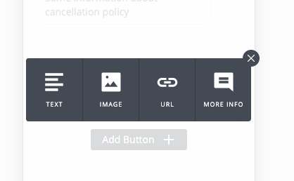
Your response can be made up of:
- A text response. You can add unlimited text responses.
- An image (maximum 1 per response).
- A button - More info. Use these to enable the user to trigger other chatbot responses.
- A button - URL. Enable the user to click through to a webpage.

How a response is constructed:
The response has a basic layout:
- Text and images
- Buttons
This follows a basic formula response formula:
- Answer the person's question.
- Create a call to action, or suggest more things the user is interested in.
There are a few restrictions:
- There are a maximum of 3 buttons, in part due to limitations within Facebook Messenger, but also because the user shouldn't be overwhelmed with options.
- The button titles must be 20 characters or less, in part due to limitations within Facebook Messenger.
- A text box must be immediately above buttons, an image immediately above is not possible.
- You'll need to ensure the image is less than 500kb, to ensure it loads quickly on devices. Check out some tips on resizing images and try again.
- There's a character limit for each text response because no customer likes long blocks of text, it's best to break up long information into multiple text boxes.
How to add a response:
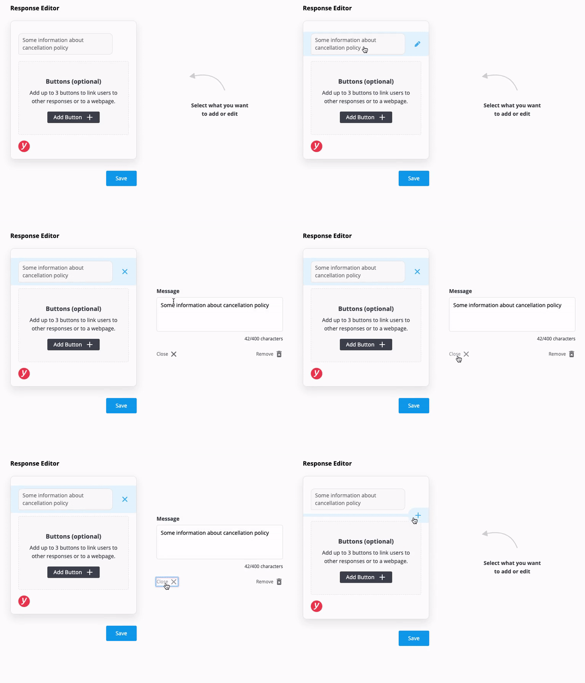
Roll your mouse above and below existing responses and you'll see a "plus" button. Click that to see the options available.
Add a text response:

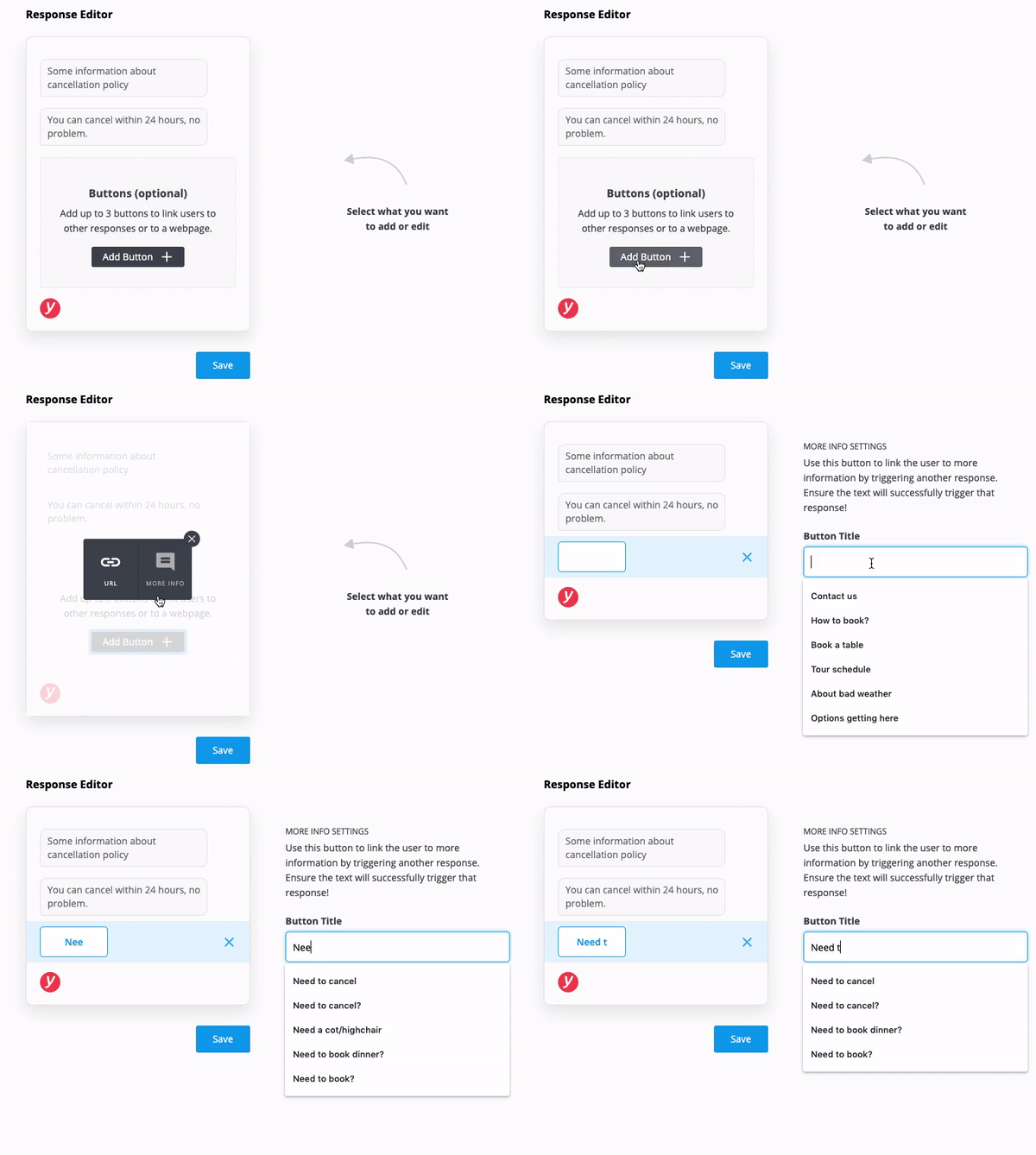
Add buttons:

About 'More info' buttons
These are a great way to create a conversation flow and let the customer explore things the chatbot knows.
Add buttons to link to other related questions. Try and understand why the user is asking that question. In the case of cancellation policy, add 'More info' button options like "Need to cancel", "Change a booking", "Coming in bad weather" or add a 'URL' button like "See full terms" with a link to your website terms and conditions.
You need to ensure the text you use on the button successfully triggers a chatbot response. See cheat sheet of commonly used phrases (coming soon!).
About 'URL' buttons
Yonder tracks the clicks of every link. You can specify with the "Track this link to booking system" if it's a booking system link so you can see, rolled up on the performance dashboard, the types of links customers are clicking.
Ensure you paste the full link, including https://.
Best practices for responses
- Don't start your response with "Yes", "No", "Great" or other words like this as you don't know if the person has phrased the question positively or negatively.
- Repeat the question at the start of the response, it creates a more natural conversation flow and it helps prevent confusion in case the response didn't quite answer the person's question. For example, if the questions is about Cancellation Policy, a good response starts with: "The cancellation policy is... ", while a poor response starts with: "You get a full refund 48 hours".
- Add buttons to link to other related questions. Try and understand why the user is asking that question. In the case of cancellation policy, add 'More info' button options like "Need to cancel", "Change a booking", "Coming in bad weather" or add a 'URL' button like "See full terms" with a link to your website terms and conditions.
